
- Find the price
- Choose an option
- Review the total
A feature should remain usable at the customer's screen size and connection quality.
Illustrative decision process, not a product screenshot or customer result.A restaurant ordering website should make decisions clear for customers and provide usable information to staff. These ten features form an acceptance checklist. They are not a claim that every website builder or Restrova package supports every possible configuration.
Ten features to test on a phone
| Feature | Customer task |
|---|---|
| Clear branch identity | Know where the order will be fulfilled |
| Readable menu | Find an item without zooming |
| Accurate descriptions | Understand portion and included items |
| Required choices | Select the necessary options |
| Visible availability | Avoid ordering an unavailable item |
| Fulfilment choice | Distinguish pickup and delivery |
| Transparent total | Understand charges before submitting |
| Useful confirmation | Know the actual order state |
| Support route | Get help with the reference |
| Responsive layout | Complete the flow on a narrow screen |
Connect the page to the kitchen
A good customer interface still needs a reliable restaurant handoff. Check that item choices, quantities and fulfilment method reach the right staff. Verify how changes and cancellations are communicated.
If the website depends on an integration, test the intended product and device rather than relying on a generic compatibility statement.
Check accessibility and failure states
Use keyboard navigation where appropriate, readable contrast and clear labels. Test missing required information and an interrupted flow. Error messages should explain how to recover without exposing private information.
Do not rely only on a large desktop screenshot. Narrow screens, long item names and optional additions can reveal layout problems that a polished preview hides.
Maintain the essentials after launch
Assign ownership for menu changes, hours and availability. Review support questions to identify unclear content. A website's accuracy can decline quickly if updates have no owner.
Explore Restrova ordering websites, published examples and pricing. Use the ordering comparison guide and request a demo with the checklist.
Does every website need animated banners?
No. Visual effects should not obstruct menu access or make the ordering flow difficult to use. Prioritize the customer's task.
Should the website promise an exact delivery time?
Only where the restaurant can support the statement and the system's actual behaviour is understood. Explain estimates and exceptions rather than presenting an unverified guarantee.
A practical check: Check ordering features on a small phone
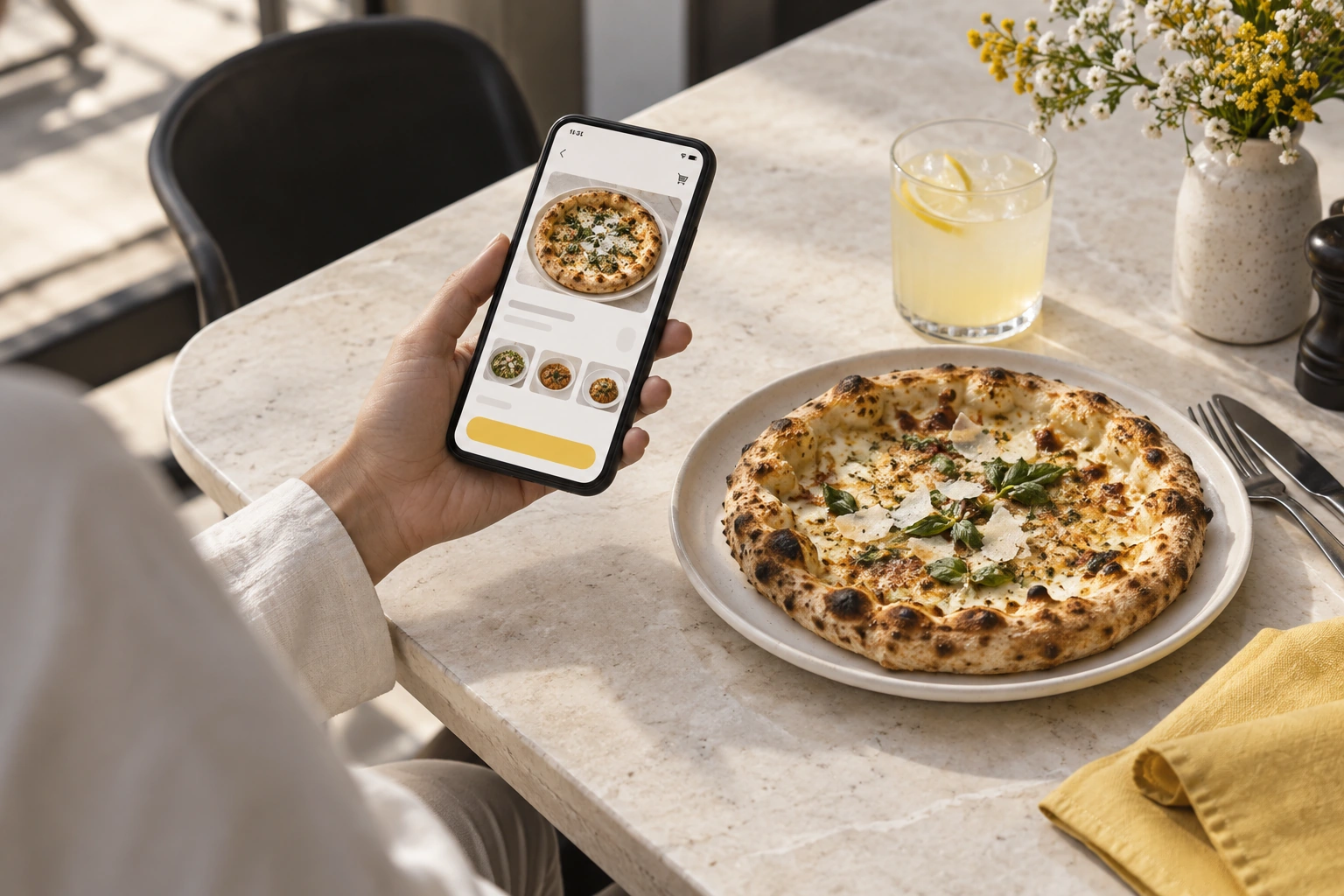
Illustrative scenario: Use a small-screen device to find prices, choose an option and review delivery charges. Verify readable text and reachable controls before expanding the page with more features.
- Find the price.
- Choose an option.
- Review the total.
Decision rule: A feature should remain usable at the customer's screen size and connection quality.