
- Find the item
- Understand the total
- Know the next step
Improve the point where the customer becomes uncertain rather than adding more decorative content.
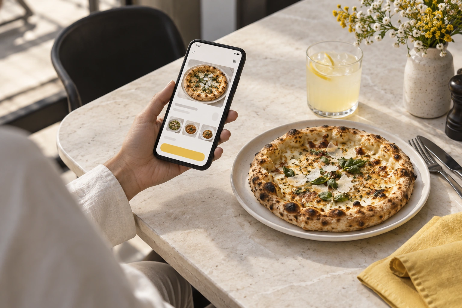
Illustrative decision process, not a product screenshot or customer result.A good ordering experience helps a customer understand what is available, what it costs and what happens next. Start with clarity before adding promotional features. Test the experience on a real phone and through the restaurant’s operational response.
Answer the practical questions early
Show clear menu descriptions, current prices and the supported fulfilment choices. Customers should be able to find business hours and contact information without guessing. Do not promise a delivery area, payment method or turnaround time until the restaurant has confirmed the actual setup.
Reduce ambiguity at selection
Use meaningful option labels and explain extra charges before the basket is submitted. Distinguish unavailable items from temporarily hidden categories. A customer should not have to infer whether a choice is required. Check text size, contrast and keyboard operation as well as appearance.
Make the final total understandable
Review the basket total and any charges or discounts. Test what happens when an option changes or an item is removed. A clear total supports an informed decision; it does not establish that every payment provider is supported. Verify the payment methods intended for launch separately.
Explain acceptance and uncertainty
Order submission, restaurant acceptance and payment confirmation may be different events. Ask how the customer sees each one. Test slow responses and retries in a controlled demonstration. Give staff a procedure for identifying an uncertain transaction rather than telling a customer to submit repeatedly.
Keep support connected to the order
The customer should know how to ask about a problem. Staff need a way to locate the relevant order without requesting unnecessary personal information. Agree how unavailable items, corrections and fulfilment failures are handled. A polite message cannot compensate for an unclear operational owner.
Review with ordinary customers in mind
Ask someone unfamiliar with the interface to find a dish, customize it and explain the total. Observe where they hesitate before explaining the screen. Compare findings with the ordering website and app demonstrations. Prioritize clear corrections and useful information over a longer checklist of interface effects.
Request a Restrova demonstration with a sample order and the specific workflow questions from this guide.
A practical check: Remove uncertainty from the customer journey
Illustrative scenario: Ask a new user to choose pickup, change an item and find the final payable amount. Observe unanswered questions before changing colours or adding promotions.
- Find the item.
- Understand the total.
- Know the next step.
Decision rule: Improve the point where the customer becomes uncertain rather than adding more decorative content.